Images now act as the main Largest Contentful Paint (LCP) element on about 85% of desktop pages and 76% of mobile pages, which means your responsive image strategy directly controls whether your site feels fast or slow.
In this guide we walk through practical ways to handle sizing, device pixel ratio (DPR), and delivery so your images load quickly, look sharp, and support strong Core Web Vitals on real devices.
Key Takeaways
| Question | Answer |
|---|---|
| How do responsive images affect Core Web Vitals? | Images often control LCP and CLS. Correct sizing, dimensions, and delivery speed are critical. Our free image optimizer helps reduce LCP image size quickly. |
| What is the role of DPR in responsive images? | DPR lets you serve sharper images to high-density screens without sending oversized files to standard displays, using srcset with x descriptors. |
| How big should my LCP image be? | On mobile, aim for 100 KB or less when possible, since about half of mobile LCP images in the wild already hit that range. Use our free image resizer to generate right-sized variants. |
| Do I really need explicit width and height on images? | Yes. Around 66% of mobile pages still miss explicit dimensions for at least one image, which can hurt CLS. Always set width and height or use CSS aspect-ratio. |
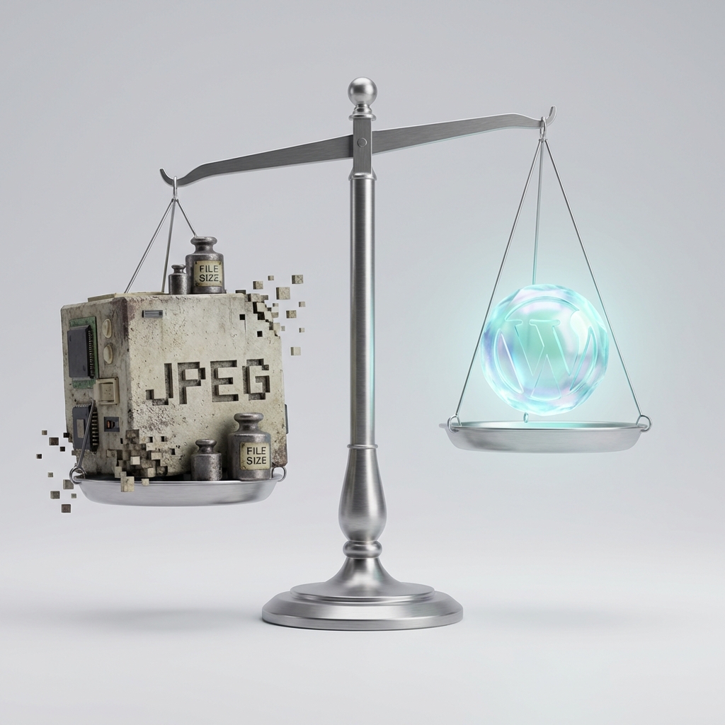
| Which formats help LCP the most? | JPG still dominates LCP, but WebP and AVIF adoption is growing. Converting heavy JPG/PNG assets to WebP using tools like our online optimizer can cut weight by 50–80%. |
| What single attribute helps LCP delivery quickly? | Using fetchpriority="high" on your main hero image is an easy win, especially when combined with proper responsive sizing. |
1. Why Responsive Images Matter So Much For Core Web Vitals
Most modern pages are image-heavy, and the largest image on the page often becomes your LCP element by default. When that image is too large, incorrectly sized, or loaded too late, your LCP metric suffers and the whole page feels slow.
At the same time, missing dimensions or layout shifts around those images can damage Cumulative Layout Shift (CLS), even if your files are well compressed and cached.
Images as the dominant LCP element
In 2025, images act as the LCP element on about 85.3% of desktop pages and 76.0% of mobile pages. That means image performance is usually page performance.
Focusing on responsive image sizing and delivery gives you precise control over the part of the page that matters most to user-perceived speed.
How responsive images connect to LCP, CLS, and INP
LCP cares about when the main content appears, CLS cares about how stable the layout is while loading, and INP measures how responsive interactions feel. Images affect all three.
Oversized hero images slow LCP, missing dimensions trigger layout jumps, and heavy carousels or galleries can make interactions feel sluggish, especially on mobile.

2. Sizing Images Correctly For Different Viewports
Responsive images start with knowing how large an image actually needs to be in the layout. If your hero area is 1200 pixels wide on desktop and 360 pixels wide on mobile, you do not want to send the same 2400 pixel wide file to every device.
Right-sizing each asset can cut file sizes dramatically without removing visible quality.
Target dimensions for key images
Map each major image to its maximum rendered width in your main breakpoints, for example 360, 768, 1024, and 1440 pixels. Then generate variants that align with those sizes.
Our free image resizer lets you quickly resize originals to multiple widths in JPG, PNG, or WebP so you have clean variants ready for srcset.
Weight guidelines for LCP images
In 2024, almost half of mobile LCP images are 100 KB or smaller, and about 30% of desktop LCP images also fall under 100 KB. At the same time, around 8% of LCP images exceed 1 MB on both platforms, which is usually avoidable.
Aim to keep mobile hero images below 100 KB when possible, and reserve larger budgets only for high-value visuals that truly require it.
3. Handling DPR (Device Pixel Ratio) For Sharp, Efficient Images
Device pixel ratio decides how many physical pixels map to one CSS pixel on a screen. On a DPR 2 device like many modern phones, a 200 pixel wide CSS element uses 400 physical pixels.
If you do not account for DPR, your images can either look soft on high-density screens or waste bandwidth on low-density ones.
Using x-descriptors in srcset
For DPR-based responsive images, you can define variants like image@1x.jpg and image@2x.jpg in srcset using the x descriptor. The browser then picks the appropriate version based on the screen’s pixel density.
A simple pattern is to generate 1x and 2x versions for critical images, keeping the 2x variant as small as possible through smart compression.
Balancing sharpness and weight
While 3x and 4x images can look extremely sharp, they can also balloon file size. In practice, covering 1x and 2x DPR with good compression and modern formats already delivers strong results for most projects.
Compressing assets using our free image optimizer, which costs USD0, helps keep both 1x and 2x variants small enough for fast delivery.
Did You Know?
In 2024, 66% of mobile pages fail to set explicit width and height dimensions on at least one image, which increases CLS risk even when images are otherwise optimized.
4. Picking Modern Image Formats For Faster Delivery
Choosing the right format for each image is a major lever for file size. While JPG and PNG still dominate LCP images, WebP and AVIF are steadily increasing their share.
The goal is simple: keep visual quality high while cutting bytes wherever possible.
Current format usage on LCP images
In 2025, LCP image formats break down roughly as JPG at 57%, PNG at 26%, WebP at 11%, and AVIF around 0.7%. That means there is still a large opportunity to replace heavy JPG and PNG assets with WebP or AVIF where supported.
For photographic content, WebP or AVIF often beat JPG at the same apparent quality, while for icons and UI elements, optimized PNG or WebP is usually sufficient.
Practical format workflow
A practical pattern is to keep a high quality source, then generate multiple outputs: JPG or PNG fallbacks, WebP as the default, and optionally AVIF for cutting-edge clients.
Our browser-based image optimizer lets you convert JPG, PNG, and WebP assets without uploads, so you can test format quality and size tradeoffs quickly.
5. Smart Delivery: fetchpriority, Preload, and Lazy Loading
Once you have the right sizes and formats, delivery strategy determines how quickly those images actually appear on screen. You control this with attributes like fetchpriority, loading, and sometimes rel="preload".
Used correctly, these options let you prioritize the hero image while deferring non-critical content below the fold.
Boosting LCP with fetchpriority
In 2025, only about 16.3% of desktop pages and 17.3% of mobile pages use fetchpriority="high" on the LCP image. This is a missed opportunity, since it is a one-line attribute that tells the browser the image is important.
Adding fetchpriority="high" to your main hero image is an easy step to improve LCP, especially when combined with properly sized responsive variants.
Balancing lazy loading and above-the-fold content
Around 16–17% of pages lazy load their LCP image, with native loading="lazy" accounting for about 10–11% of usage. Lazy loading is great for long pages with many images, but it can hurt LCP when used on above-the-fold content.
A useful rule is to avoid lazy loading for any image in the initial viewport, and use loading="lazy" for secondary content that sits further down the page.

6. Preventing Layout Shift With Fixed Dimensions
CLS problems often come from images that load without defined space, pushing text and buttons down as they appear. This is still extremely common, even on production sites.
The fix is simple: always give images either explicit width and height, or a CSS aspect ratio that reserves space before the file downloads.
Why explicit dimensions matter
When you set width and height attributes that match the intrinsic dimensions of the responsive variant, the browser can calculate layout before the image finishes loading. As a result, content around it stays stable.
If you later change the rendered size in CSS, keep the same aspect ratio so the reserved space remains accurate.
Aspect-ratio and picture elements
You can combine picture elements and srcset with CSS aspect-ratio to keep a consistent layout while still serving different files for various breakpoints.
This approach is useful for responsive hero sections that change shape across devices, since the layout can adapt without unexpected shifts.
7. Compression Strategies That Protect Quality
Compression lets you reduce file size without a visible hit to quality when used carefully. The key is to differentiate between aggressive compression for non-critical imagery and more careful settings for hero media.
You can also mix lossy and lossless strategies based on content type.
Lossy vs lossless decisions
Photographs and gradients usually handle lossy compression well at moderate quality settings. Icons, logos, and UI textures often benefit from lossless or near-lossless compression to keep edges crisp.
Our online optimizer provides an auto-optimize mode that aims for 50–80% reductions with minimal visible change, which is effective for bulk workflows.
Batch workflows for responsive sets
When you generate multiple sizes and formats, it is efficient to compress them in a single pass. That way, your 1x and 2x variants share consistent quality while still dropping unnecessary bytes.
Since our tools run locally in the browser, you can test various compression levels quickly without uploading assets to a server.
Did You Know?
In 2024, 48% of mobile LCP images are already 100 KB or smaller, but around 8% of LCP images on both mobile and desktop still exceed 1 MB, leaving significant room for optimization.
8. Workflow Example: From Original Asset To LCP-Ready Image
To make this concrete, it helps to outline a repeatable workflow for each important image on your site. This keeps your responsive strategy consistent across pages and teams.
You can adapt the details, but the overall pipeline stays similar.
Step-by-step responsive image workflow
- Start from a high quality source file, such as a large JPG or PNG.
- Use our free resizer to generate multiple widths, for example 480, 768, 1024, and 1440 pixels.
- Convert each width to WebP using the optimizer, testing compression levels to stay under your target KB budget.
- Define a
pictureelement with WebP sources and JPG or PNG fallbacks, includingsrcsetand sizes attributes. - Add
fetchpriority="high"to the hero image and explicit width and height attributes to stabilize layout.
Checking results against Core Web Vitals
After deploying the new image set, monitor LCP and CLS using your performance tools. You should see faster paint times for the hero content and more stable layouts.
If any metric still looks weak, adjust size, compression, or delivery order, then re-test.
9. Common Responsive Image Mistakes That Hurt Core Web Vitals
Even experienced teams run into a set of recurring issues when handling responsive images. Recognizing these patterns early can save you a lot of debugging time.
Most of them stem from mismatches between layout, sizing, or delivery attributes.
Oversized images for small slots
A common mistake is sending a full-width desktop hero image to small mobile viewports. This wastes bandwidth and slows LCP, especially on slower connections.
Always ensure that the largest file the browser can pick is close to the actual rendered size on that device.
Lazy loading above-the-fold content
Setting loading="lazy" on every image, including the hero, is another frequent problem. It looks tidy in code, but it delays the main content and harms LCP.
Instead, lazy load only images that users cannot see initially, such as gallery thumbnails further down the page.
10. How SmolPixel Supports Responsive Images And Core Web Vitals
We built SmolPixel specifically to help you manage image sizing, compression, and conversion quickly, without complex setups or uploads. All tools run entirely in your browser for privacy and speed.
This makes it simple to align your responsive image pipeline with Core Web Vitals requirements.
Free tools focused on modern web images
Our resizer and optimizer tools both cost USD0 and support JPG, PNG, and WebP images. You can resize for multiple breakpoints, compress large assets, and convert formats in a few clicks.
Because everything runs locally, you keep full control over your source files.
Designed with Core Web Vitals in mind
We focus on use cases like shrinking LCP hero images, preparing responsive sets for high-DPR devices, and converting to efficient formats like WebP. These improvements directly help LCP and CLS outcomes for real users.
Combined with correct HTML attributes and delivery strategies, our tools become a practical part of your performance workflow.
Conclusion
Responsive images sit at the center of modern performance, because they usually control the main visual content that users care about most. When you handle sizing, DPR, and delivery correctly, your pages feel faster, more stable, and more polished across devices.
By combining structured image variants, sensible DPR coverage, modern formats, careful compression, and smart delivery attributes, you can build a repeatable workflow that supports strong Core Web Vitals without adding complexity for your team.