Only about 58% of images on a typical page include alt text, which means nearly half of visual content is invisible to assistive technologies and poorly optimized for performance and discovery.
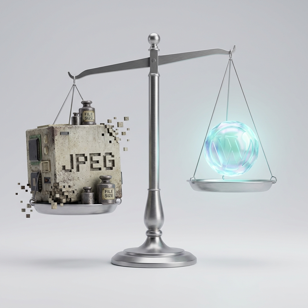
We built SmolPixel to help fix problems like this at the file level, and in this guide we focus on how to pair optimized images with smart implementation: lazy loading, responsive images, high quality alt text, and well structured image sitemaps.
Key Takeaways
| Question | Answer |
|---|---|
| How do I prepare images before adding lazy loading or responsive markup? | Always start by resizing and compressing images. Our in-browser tools like the Free Image Resizer and the Free Image Optimizer help you reduce weight without losing quality. |
| What is lazy loading and when should I use it? | Lazy loading delays off-screen image loading until users scroll near them. Use it on images below the fold and leave above-the-fold or key hero images to load normally. |
| How do responsive images help performance and accessibility? | Responsive images send different sizes or formats to different devices, which reduces bandwidth and keeps layouts stable on all screens. |
| What makes alt text “good” for users? | Good alt text is concise, accurate, and contextual. It describes what matters in the image from the page visitor’s point of view, especially for screen reader users. |
| Do I need an image sitemap for every site? | Simple sites may not need one, but image heavy sites benefit from an image sitemap that lists key image URLs and metadata in a structured way. |
| Can I handle everything using only online tools? | You can handle most file prep online. Our home page at SmolPixel connects you to free tools that run 100% in your browser, with no uploads or logins. |
| Where can I learn more about formats, compression, and accessibility? | Our Image Optimization FAQ covers file formats, compression levels, and practical accessibility tips for modern websites. |
1. Why optimized images matter for accessibility and performance
Images appear on virtually every modern page, with data showing that 99.9% of pages request at least one image.
If you optimize how those images load, resize, and describe themselves, you improve both performance and accessibility for almost every user.
Well implemented images reduce bandwidth usage and speed up key visual content, especially on slower connections.
They also support users who rely on assistive technologies, by making sure visual information is not lost when images cannot be seen or loaded.
At SmolPixel, we start with file level optimization and then align markup techniques like lazy loading, responsive images, and alt attributes with that lean image foundation.
This combination keeps your pages fast, visually consistent, and readable for everyone, regardless of device or ability.
2. Preparing images the right way before implementation
Lazy loading or responsive markup cannot fix oversized, heavy images, so proper preparation comes first.
We recommend a simple workflow: resize to the maximum display size, compress to reduce file size, then convert to a modern format where appropriate.
Resizing and compression with SmolPixel
Use the Free Image Resizer to create images that match real layout dimensions, such as hero widths, card widths, or thumbnail sizes.
Then run those files through the Free Image Optimizer to cut file sizes by up to 80% without visible quality loss.
Choosing formats for modern browsers
In 2024, JPEG images still account for roughly one third of images, while WebP and AVIF continue to grow because they can be much smaller at similar quality.
We encourage teams to keep a compatible base format like JPEG or PNG and offer modern formats like WebP as alternatives when possible.
3. Lazy loading images without harming key content
Lazy loading delays the loading of images that the user cannot see yet, which cuts initial page weight and speeds up first impressions.
In 2024 around 24.6% of mobile pages and 24.3% of desktop pages set the native loading="lazy" attribute on images, so this pattern is already widely understood.
When to use lazy loading
Use lazy loading for images below the fold, long article galleries, or product grids that continue below initial screen height.
Avoid lazy loading for hero images, logos, or other elements that must appear quickly, because delaying them can hurt perceived speed and stability.
Practical lazy loading implementation tips
Use the native loading="lazy" attribute as your default, and keep markup simple for maintainability.
Combine lazy loading with properly sized placeholder spaces to avoid layout shifts when images appear.
Did You Know?
Even with lazy loading available, 71.9% of desktop pages and 71.8% of mobile pages in 2024 still did not set any image loading properties, leaving a lot of performance and user experience benefits on the table.
4. Responsive images that fit every screen
The median page has around 14.5 images, and home pages often have closer to 18 or more, so sending the right image size to each device is critical.
Responsive images prevent small screens from downloading huge desktop assets, which reduces bandwidth and helps layouts stay stable.
Using srcset and sizes correctly
The srcset and sizes attributes on <img> let the browser choose from multiple image versions, based on device width and pixel density.
We suggest exporting a small set of breakpoints, such as 480, 768, 1024, and 1440 pixels wide, using our resizing tool for quick batch preparation.
Responsive background images and picture element
For decorative or full width backgrounds, use CSS media queries to load different background images at different breakpoints.
For content critical images that need format switching, use the <picture> element to offer WebP or AVIF first with JPEG or PNG fallback.
5. Alt text fundamentals for accessibility and context
Alt attributes exist primarily for accessibility, yet only about 58% of images at the median include them, and many are empty or unhelpful.
For users who rely on screen readers, good alt text is often the only way to understand visual content.
When to write alt text and when to leave it empty
Add descriptive alt text to images that carry information, such as product photos, diagrams, or screenshots that support the page content.
Use empty alt attributes alt="" for purely decorative images that add no meaning, such as subtle background flourishes or spacers.
Writing high quality alt text
Describe what is important in the image, not everything that appears, and keep the text concise and clear.
Avoid phrases like “image of” or “picture of” because screen readers already announce that the element is an image.
6. Advanced alt text: context, repetition, and complex images
Beyond basic descriptions, you also need to consider context, repetition, and how to handle complex visuals like graphs.
The goal is always to support the information that a sighted user would get from the page, using a practical level of detail.
Avoiding repetitive or redundant alt text
If the same image appears multiple times, you do not have to repeat long descriptions unless each instance has a different purpose.
If surrounding text already fully describes the image, shorter alt text is usually enough.
Complex charts, diagrams, and UI screenshots
For complex images, provide a brief alt text summary and then add a nearby text description or data table for full detail.
This approach keeps screen reader output manageable while still preserving complete information.
Did You Know?
On the top one million home pages in 2024, about 21.6% of images had missing alt text, and 14.6% of images with alt text used questionable or repetitive descriptions that did not really help users.
7. Structuring image sitemaps for image heavy sites
Image sitemaps provide a structured list of important image URLs and related metadata, which is especially helpful on large or image heavy sites.
You can add image entries to your existing sitemap or create a separate image specific sitemap that keeps things organized.
Key image sitemap fields
Each <url> entry in an image sitemap can contain up to 1,000 <image:image> tags, which is usually enough for galleries, listings, or media libraries.
Metadata such as image captions, titles, or geographic information can be included where relevant, especially for detailed photography or location based images.
When to prioritize an image sitemap
Media rich sites like travel, real estate, news, or e commerce benefit from clearly listing key images and variants.
If your site only uses a handful of images and they are already well linked in the HTML, a shared standard sitemap may be enough.
8. Combining lazy loading, responsive images, and alt text
The strongest results come from combining these techniques rather than treating them in isolation.
You can think of this as three layers: file optimization, smart loading behavior, and accessible descriptions.
A practical implementation checklist
First, resize and compress source images using tools like our in browser resizer and optimizer.
Second, add responsive markup with srcset and sizes, and apply lazy loading to off screen images only.
Third, review alt attributes across templates or components and ensure non decorative images always have meaningful text.
Testing with real devices and assistive tech
Test image behavior on different network speeds, screen sizes, and device types to see how quickly key visuals appear.
When possible, test with screen readers to confirm that alt text and focus order match your expectations.
9. Using SmolPixel in an accessible image workflow
Our tools focus on the preparation stage so that your implementation work starts with optimized images.
Because everything runs locally in the browser, you can resize, compress, and convert images without uploading files to a remote server.
Free Image Resizer for clean dimensions
The Free Image Resizer supports JPG, PNG, and WebP, plus smart cropping and cover or contain modes.
You can quickly produce consistent hero, banner, or thumbnail sizes that map directly to your responsive breakpoints.
Free Image Optimizer for smaller payloads
The Free Image Optimizer compresses JPG, PNG, and WebP, often cutting file sizes by 50 to 80 percent.
With lean files in place, lazy loading and responsive markup have a much bigger impact on real users.
10. Common mistakes to avoid with image implementation
Even experienced teams slip into patterns that slow pages or reduce accessibility, especially under time pressure.
A short checklist of pitfalls helps keep standards clear across multiple contributors and projects.
Technical mistakes
Do not lazy load crucial hero or logo images that need to appear immediately.
Avoid sending oversized images without width and height attributes, because this can cause layout shifts as pages load.
Accessibility mistakes
Do not leave alt attributes out entirely on content rich images, since this blocks access for screen reader users.
Avoid copy pasted, keyword stuffed, or irrelevant alt text, because it distracts rather than helps.
Conclusion
Optimized images sit at the intersection of fast performance and inclusive design, and small implementation details make a measurable difference.
By pairing lean source files from tools like SmolPixel with lazy loading, responsive images, thoughtful alt text, and well structured image sitemaps, you create pages that load quickly and communicate clearly to every visitor.